
Aquasure USA
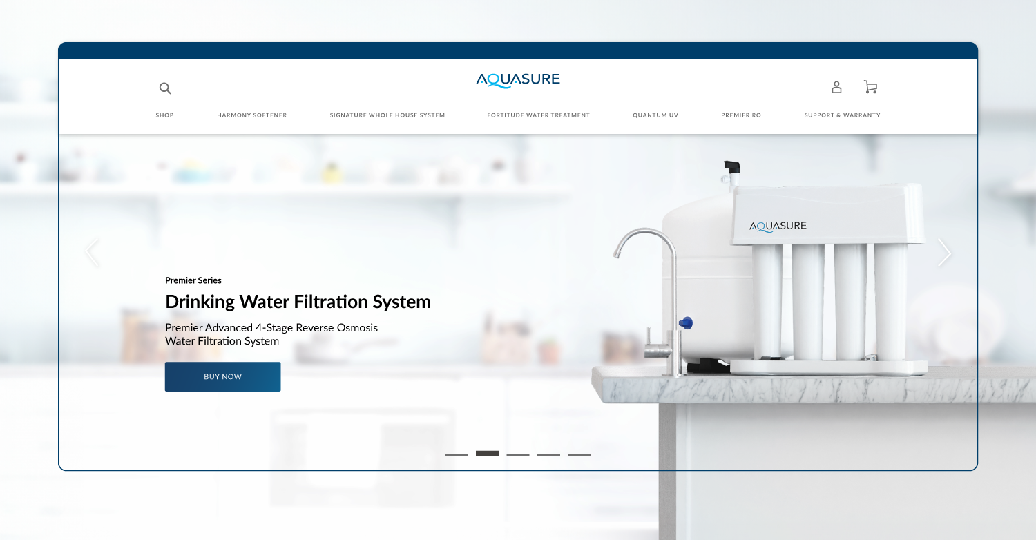
The primary goal was to create an extraordinary online space that surpasses competitors in water filtration. The aim is to make product information easy to navigate and enjoyable. The redesign enhances user experience, engages users, and presents visually appealing and understandable information.
Key Improvements
User-Centric Design: The heart of this redesign lies in placing our users at the forefront. We meticulously reimagined the user interface, ensuring every element serves a purpose – to provide a cohesive, accessible, and immersive experience.
Intuitive Format: We recognized the need for clarity in understanding the intricate details of each project. By introducing an intuitive format, we've transformed complex information into digestible nuggets, enabling you to grasp project nuances effortlessly.
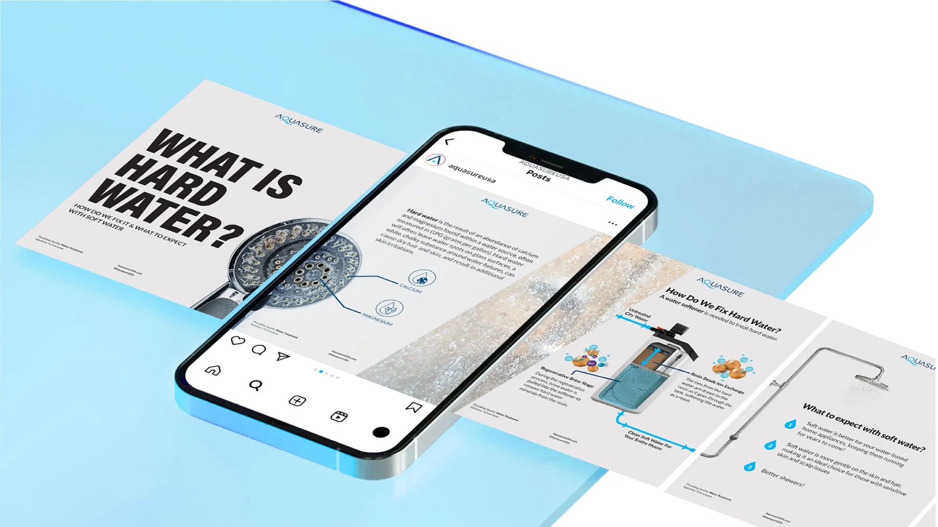
Engaging Visuals: We understand the power of visuals in conveying concepts effectively. Through vibrant imagery and interactive visual aids, we've woven a visually appealing tapestry that makes exploring projects an immersive experience.
Outcomes
The result of this redesign project is a website that mirrors AquasureUSA's dedication to innovation and excellence. Navigating through products is no longer a chore; it's an exploration, an immersion into the world of water filtration. I’m proud to present a digital space that not only informs but also inspires – an embodiment of AquasureUSA's vision for a brighter, sustainable future.

A brand designed to adapt, respond, and evolve.
Designed to be versatile enough to work in different formats and channels, allowing it to communicate effectively with people regardless of their background, role, or expertise.


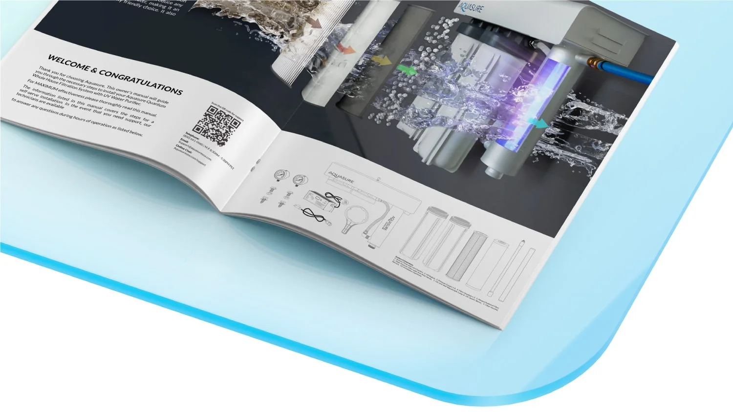
Environments made using a three-dimensional design idea.
The branding includes various shapes that can function as moving indicators, borders, and emphasis points. These shapes assist in directing individuals as they navigate through both physical and digital environments based on their intuition.


